React Parliament Part 2
I implemented this phase during a Livestream
Creating a Modal⌗
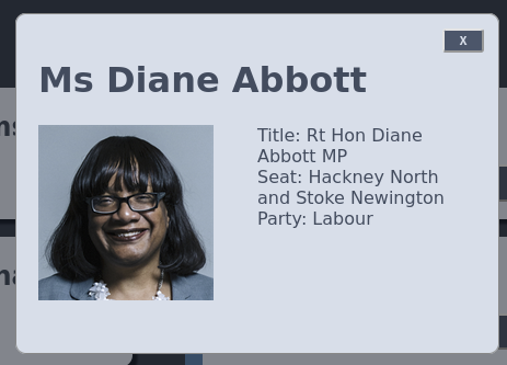
When the details button on the cards are clicked I wanted to bring up a modal with more information about the MP.
I created a new React component for the modal
import React, { useState } from "react";

function MemberModal(props) {
  return (
    <div
      className="info-modal"
      style={{ display: props.showModal ? "block" : "none" }}
    >
      <div className="info-modal-content">
        <h1>{props.member?.value?.nameDisplayAs}</h1>
        <div className="row">
          <div className="column">
            <img
              className="member-portrait"
              src={props.member?.value?.thumbnailUrl}
            />
          </div>
          <div className="column">
            <div>Title: {props.member?.value?.nameFullTitle}</div>
            <div>
              Seat: {props.member?.value?.latestHouseMembership.membershipFrom}
            </div>
            <div>Party: {props.member?.value?.latestParty.name}</div>
          </div>
        </div>
        <button className="close-button" onClick={props.onDetailsCloseClick}>
            x
        </button>
      </div>
    </div>
  );
}

export default MemberModal;
Much of this is somewhat similar to the code in the member card component from Part 1, but there are a couple of interesting additions.
style={{ display: props.showModal ? "block" : "none" }}
This tag on the containing div controls whether or not show the modal on the basis of a passed in property.
onClick={props.onDetailsCloseClick}
This is a callback, which will call a method in the parent component (more on that later).
I also found some modal styling online, and modified it with the help of Twitch chat:
/* The Modal (background) */
.info-modal {
  position: fixed;
  z-index: 1; /* Sit on top */
  padding-top:5em; /* Location of the box */
  left: 0;
  top: 0;
  width: 100%; /* Full width */
  height: 100%; /* Full height */
  overflow: auto; /* Enable scroll if needed */
  background-color: rgb(0,0,0); /* Fallback color */
  background-color: rgba(0,0,0,0.4); /* Black w/ opacity */
}

/* Modal Content */
.info-modal-content {
  background-color: #D8DEE9;
  color: #434c5e;
  margin: auto;
  padding: 20px;
  border: 1px solid #888;
  width: 25em;
  border-radius: 0.6em;
  padding-bottom: 3em;
  position:relative;
}
Here is how it ended up looking:
Ricing the cards⌗
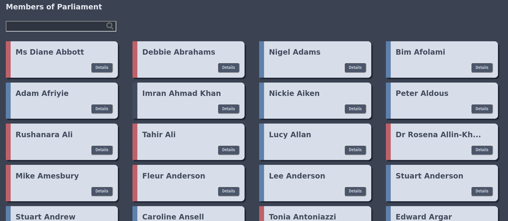
Since the API provides information on the party of each MP, i wanted to put accents on the cards to show this at a glance.
function getColorFromParty(party) {
    switch (party) {
      case "Lab":
        return "#bf616a"
      case "Con":
        return "#5e81ac"
      case "LD":
        return "#d08770"
      case "SNP":
        return "#ebcb8b"
      case "SF":
        return "#a3be8c"
      case "UUP":
        return "#81a1c1"
      default:
      // code block
    }
  }
  function formatMemberName(name)
  {
    if (name.length >= 20)
      return name.substring(0, 18) + "...";

    return name;
  }
I achieved this with a simple case statement based on the shortcode of the member’s party, I also truncated long names to keep the cards looking consistent.
<div
      className="card"
      style={{ borderLeftColor: getColorFromParty(props.member.latestParty.abbreviation) }}
>

...


<h2>{formatMemberName(props.member.nameDisplayAs)}</h2>
The button was also modified to have an onClick callback and a key value:
    <button
        className="button"
        onClick={props.onMemberCardDetailsClick}
        value={props.listId}
    >
The value is used by the parent to know which card’s details button was clicked.
Tying everything together in MemberList⌗
Since giving each card its own instance of the modal felt wasteful, I had a single instance of the modal component owned by the memberlist, which would be populated with information from the button click callback.
<MemberModal member={SelectedMember} showModal={ShowModal} onDetailsCloseClick={closeDetailsModal} />
Here we can see the onDetailsCloseClick callback property from the modal being used - ‘closeDetailsModal’ will be called on this component when the callback is raised in the child:
    function closeDetailsModal(evt) {
        setShowModal(false);
    }
  }
Set show modal is the setter on the ShowModal property state variable, so taking the last two snippets together we can see that when the close button on the modal is clicked, the parent component set’s its ‘showModal’ property to false, closing the modal.
Similarly, when the details button is clicked on a card, we can get the ‘value’ property we defined on it back to set the SelectedMember property, which the modal uses to render the Member in question:
function handleDetailsClick(evt) {
    setSelectedMember(FilteredMembers[evt.target.value]);
    setShowModal(true);
  }
Deploying to Linode⌗
With everything working how I wanted it, I decided to upload my project to Linode.
I set up the cheapest node they offer, then ssh’d to it and added a user.
ssh root@mylinodeip

user add webuser
passwd webuser
I also installed apache2
sudo apt install apache
And gave the new user access to the www directory
sudo chmod 755 /var/www/html/
sudo chown -R webuser:www-data /var/www/html/chmod /
I then copied a deployment script off the internet to build the app and scp it onto the machine, then restarted apache
systemctl restart apache2
Conclusions and Next Steps⌗
React is pretty nice. I like how terse the syntax is, and how it doesn’t add much to base javascript. It was really nice designing the UI alongside Twitch chat, given I don’t exactly have a good eye for design.
I want to try out Tailwind CSS next, possibly with a more complicated React app with a dotnet backend.